"Mommy, can I stay the night at Tati's? I wanna take a bath!"
Our next home in the real inspiration series, is one that both my child and I love.
Tammy's (aka Tati) Place
During one of her visits with Tati, Munch enjoyed a bath in the Jacuzzi tub with bubbles and, as she put, "the BEST soap ever... smell me, Mommy. mmMMmMM Don't my arms smell so good?"
We've been using "Tati soap" ever since.
For her birthday, the kid made Tati a card (I don't think she ever gave it to her - tacky, I know) that listed out the 31 things she loves most about her. Among other things (her hair, her hugs, her food, etc.), Munch added her house to the list. While I'm sure she has her own reasons, we agree Tammy's house (and hair and hugs and food) is great!
Landscape - Curb Appeal
Tammy's home looks great from the inside AND outside. When you pull-up, there's a clear landscape design... you can see every bush and flower, along with their location, is intentional. Her husband spends his weekends handling the yard work and it really shows!
The fruit of his labor is in the impeccably manicured front yard but the BEST part is his personal touches to the back yard. Stone walk ways, a fire pit, a DIY pergola, multiple gardens, pretty little flowers that line their tall privacy fence, the sprinkler system he installed, landscape lighting... It's something out of a BBQ lover's dream :) Tammy's even added her touch by bringing the comfort of the indoors outside with pillows, candles, lanterns and more. CAN YOU SMELL THE FRESH CUT GRASS?
It's a great space for entertaining and adds so much value (both resale and visual) to their home.
Paint - Highlight the Best
Tammy's kitchen is the heart of her main level. One can see it from every room on that floor. When she gave me the tour of the house, she walked me back to the kitchen and the bright turquoise color painted onto the walls made me SMILE.
It was bold.
Tammy excitedly explained the purpose for the color is to have her home's heart beat in the kitchen. She wanted the color to be cool and tropic but also pack a big punch. We talked about how we both loved the color and our conversation trailed off to the other aspects of the kitchen she wanted to change. She couldn't figure out what the previous owners were thinking when they designed the space - white traditional cabinets, black sleek modern granite, Italian rustic backsplashes... it was an eclectic blend but guess what, Islanders? I didn't even notice it.
That perfect pop of color on the walls highlighted the best attributes of the kitchen - large windows that frame their beautiful backyard, the oversized island that's perfect for us to sit and sip tea, the view of her gorgeous fireplace in the family room...
Her use of color flattered the space and made her "concerns" a non-factor until she's ready to make changes.
Tchotchke Done Right
Tammy and I share a love of home décor. Date nights with my boo often include a trip to Pier1. Décor is FUN for us :)
Tammy's home has a great blend of large statement pieces and smaller functional furniture.
Her house, generally speaking, has larger-scale tchotchke. There's the accent pieces topped with fabulous statues, or the centerpieces on every table... the apothecary jars filled with seasonal décor atop her baker's rack... It's these little things that complete the rooms without adding clutter.
His and Hers - Separate but Blended
Tammy and her husband have clearly defined roles in their home's design. The basement is the man cave complete with the bar-height game table, wet bar, game room (with an awesome foosball table), gym and his office.
Langston built a beautiful entertainment center from pallets and crates, he refinished the basement himself and you can FEEL that it's a labor of love. It's clearly a manly man cave but it has the warm and inviting functionality all guests can enjoy.
Tammy uses one of the upstairs bedrooms for her office/craft space. It's bright and cheery and has an awesome corner window to view the backyard. Tammy is the person who never lets a holiday or birthday pass without making sure her loved ones feel special. During Christmas her space becomes Santa's workshop for all of her little boos!
I love how each of them have their own space to be who they are without the input or pressure of the other. It's good to have a personal retreat within your home... especially when you share it with someone else.
Home - A Grown-Up Version
Tammy owned her bi-level condo before purchasing their large single-family home with her husband. The condo became a girls' retreat for myself and many of our friends. She had fun in the design - red sofa set in the family room, funky artwork, a swanky white sofa in the living room, a spa bathroom any girl would love. Her husband moved in and, with him, came large manly furniture, collectibles from his travels in the military, lots of uniforms and... well, tools. O and tools. Did I mention tools?
I remember giggling as I watched my neat-freak friend about lose her mind because her space wasn't working with his stuff. Furniture didn't fit. Tools had no place to go. Wedding gifts needed to find places and... well, tools. Did I mention tools? Where could she store them?! It was impossible to bring the two styles together in the old place.
The new place? Shoot, it's the perfect harmony of masculine-meets-feminine. In tune with her girly-girl style but mindful of her manly-man, Tammy hasn't compromised on floral prints (the large entry rug, pictures, centerpieces, bedding, pillows and more). She has, however, only purchased them in natural colors.
GENIUS!
When the colors are blue, green, brown, tan and white, the guys don't hardly notice (or care) that floral prints are predominant in a room's design. Tammy's use of subtle floral prints also mix well with the mahogany wood tones of the furniture inherited from hubby (now in the family room).
Subtly Sentimental
Have you seen the Keeping Up with the Kardashians episode when Kourtney spoke about not wanting to have pictures on display in her home? Or the time they made fun of their mom for having a shrine of pictures all over her place?
Yes, I watch the show. Yes, I pay more attention to the home décor and fashion than the drama. JUDGE ME NOT, Islanders.
In the case of Tammy's home, there's a great mix of model home design and sentimental personalization.
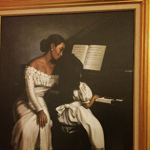
In addition to the artwork with meaningful sayings about family, love and life, Tammy also has a lot of photos (of others) on display... but only in two areas of her home - the family room book case and her armoire in her office.
Nowadays, people take photos and trash 'em as soon as they get 'em (thanks, social media). I just love Tammy's photo display because it's nostalgic to the days when you didn't care what it looked like, pictures of loved ones were taped onto mirrors, shoved in binder sleeves... just accepted for the purpose they were given - to be viewed and enjoyed (I got 8 wallets for Munch's school pics, if you get one them bad boys, "you is important. You is kind" like from the movie The Help - LOL. It means something to know she'll put my baby's pic in a frame and not in the trash).
I don't want to be like Mama Kardashian with a shrine to myself and I don't want to be like Kourtney Kardashian banning photos from my home that may not "match" ... I want to be like Tammy. I want to cherish the memories I make with people and have subtle reminders of good times so, when things aren't that good, I have something to look on and smile.
I hope you're as inspired as I am! More to come tomorrow.
Sheena's place is up next!


