
I've shared pictures of the dining room with you and, since we've made some progress, I thought I'd share an update.
We found our dining room set pretty early in the moving process. I love it:

Hubbs delivered it and set it up day one of us in the new place:

Thanks to Sheena and Dom, we had fabulous curtains for the dining room. I was so excited to have Hubbs hang them:

Once again, this dude has no shirt on. Whatever. The job was done.
At night, we keep them closed:

During the day, however, I open them to let the sunlight in:

I wanted a mirror and a centerpiece. I didn't, however, want either of them to be the same color and/or material as the table. It's a darker wood and, embracing the natural light and the floors, I wanted these additions to be lighter in color and to reflect the light.
Yesterday, I mentioned the large mirror I found at the model home sale. It's awesome. Like, really awesome... Like, my-bootleg-cell-phone-pics-don't-do-it-justice awesome.
You'll formally meet 'the mirror' in the next few pics.
I want to share the paint colors first.

It's a Sherwin Williams color and I just love the depth of most of their neutral colors. It's a green-y, gray-y, blue-y kinda gray... I first saw it in some rooms online a few years ago:
%5B5%5D.jpg)


I just love how it makes a statement but is very neutral... How it is casual yet formal. This perfect blend seemed perfect for our dining room. Similar to the table's requirements, I wanted the wall color to be appropriate for holiday dinners but not SO formal that it didn't fit the feel of the rest of the house.
The dining room has a chair rail (moulding mid-wall) so I decided to do a color combo with Comfort Gray on the top and white on the bottom.
HAVE YOU EVER TRIED LOOKING FOR THE PERFECT WHITE?
It's a challenge and, after searching for the perfect white, I decided on the white at the top of the Comfort Gray color swatch, Spare White. It's white but has the same undertones as Comfort Gray. It provides the contrast I'm looking for without the fear of pink or yellow undertones once on the walls.
I trust Comfort Gray and, if Spare White lives on the same color swatch, I trust Spare White too, lol.
I set to painting...

I started with the edges first:

I absolutely LOVED how it turned out:

I wasn't quite finished. The top was done and it looked fab. Now, however, it was time for the Spare White on the bottom:

I was pleased!
It was dark out by the time I finished so I decided to hang the mirror and wait until the following day to fully celebrate.
Sidebar: I painted so much in the old place that Hubbs and I found the move-in ready tan of the new place to be refreshing. We vowed to keep the new place neutral so I'm sure Hubbs is surprised that, as time passes, I'm painting. He's probably surprised and annoyed... I know he's determined not to help me unless I really really need it, lol. Don't get me wrong, he's willing to help me with decor and hanging and cleaning and some shopping BUT painting?!
"I thought you promised NOT to do that?" ~Hubbs
Whatever. I'm a perfectionist with the paint so I don't mind doing it solo. Seriously. By way of example, I painted the walls and noticed the underside of the crown moulding was the OLD wall color. It wasn't really noticeable but I knew it would drive me crazy. NOT TO FEAR! I used my tiny craft brush and a disposable shot glass (event remnants) to paint the bottom of the crown moulding Comfort Gray. Extra, I know.
Back to the mirror. I called for Hubbs' help. He thought I needed him to help paint. Yea right. I needed his help rehanging my mirror.


It's huge. Like, 5 feet of pure awesomeness huge. The mirror compliments the curtains from Dom and Sheena. O and, speaking of the curtains, the curtains have a circle that is a blue-gray and matches the walls perfectly! Woot!!

Night shot.

Daytime Shot. Why is the light on? IDK.
The mirror works perfectly with the centerpiece!

I shared most of my antique/thrifty finds from our trip to Georgia. I still have a few fab finds to share. One of them is the mirrored vase:

Thrift/antique malls have booths that are rented by vendors. Items have tags with the booth number, item description and price (this helps the cashier track what was sold). Some items are antiques, some are junk, all are unique. My favorite booths to visit are those with one-of-a-kind pieces. Anyhoo, Mom and I were carting our way through a thrift mall when I noticed a mirrored vase. It was fab, very heavy and, after further investigation, I realized it was a custom piece. I paid $30 for it. Sure, that is more than I would normally pay for a thrift store find BUT it was the dose of glam I wanted for our table.

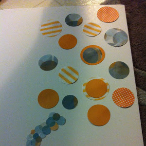
We will discuss the vase filler soon enough. Those little things come from all over and were *literally* hand-picked (and paid for individually) to ensure I loved every one of them!
I'm not sure the filler is perfect BUT I love that they all have a story and that they tie in with the circles and the casual elegance I've been pulling together over the years.
If it sounds crazy remember it's for a good cause!
Have you painted recently?
Do you have any go-to colors?
Feel free to share yours in the comments.
After all, I do plan to paint more rooms!!
Shh, don't tell Hubbs.


Post a Comment